On The Counter
On The Counter is a skincare routine that is simple and effective. Skincare has gone from being an afterthought to becoming a constant priority of self-care. It can be difficult to navigate your way through the trends of skin care and to know what you need. On the Counter is beneficial to all skin types. On The Counter, with its pharmaceutical base, simplifies those choices while not sacrificing effectiveness.

Mood Board

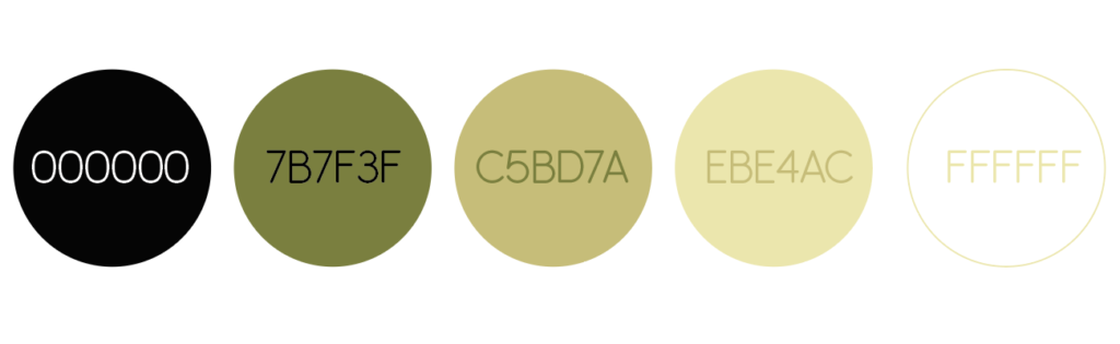
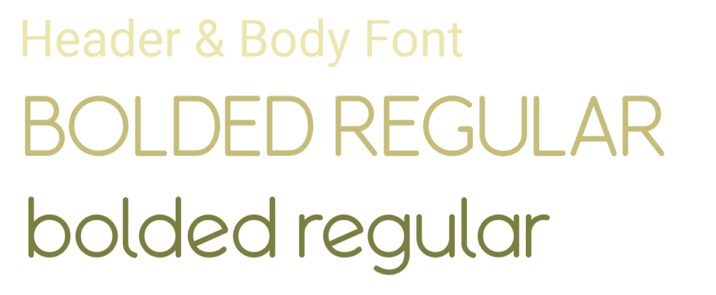
OTC mirrors the joy of a clean counter space. On The Counter creates a foundation for the next part of your day, at the beginning or at the end. The colors replicate those of a spa, with refreshing and cooling tones. Natural and organic, the font, Bolded Regular, is either all capitals or lowercase to create a seamless look.
Fonts & Colors
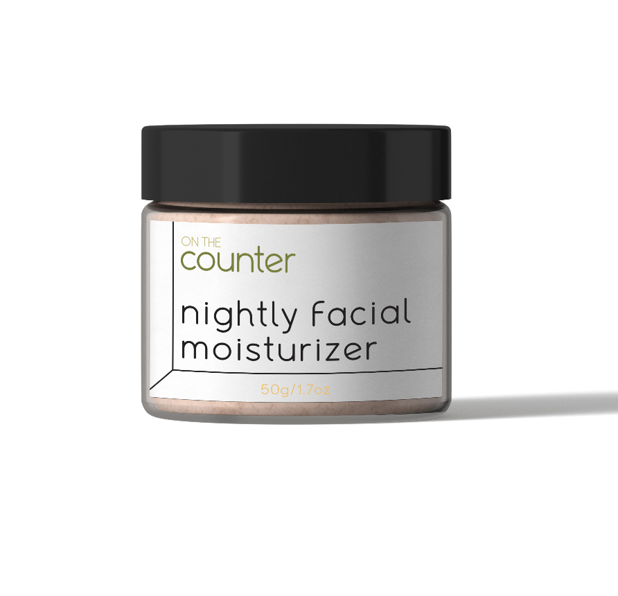
Serum Packaging

The logo replicates the counter space with just a few lines where the wording sits, just as the products will actually be by the sink. The same concepts are adapted to the package design and create consistency. OTC is not meant to be flashy, it has a scientific aesthetic for increased credibility due to its dedication to the ingredients.
Skincare Line Packaging
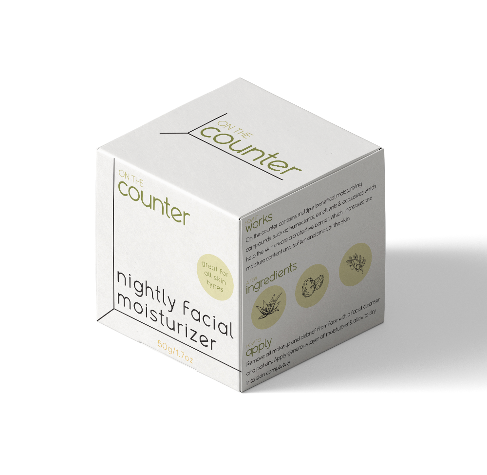
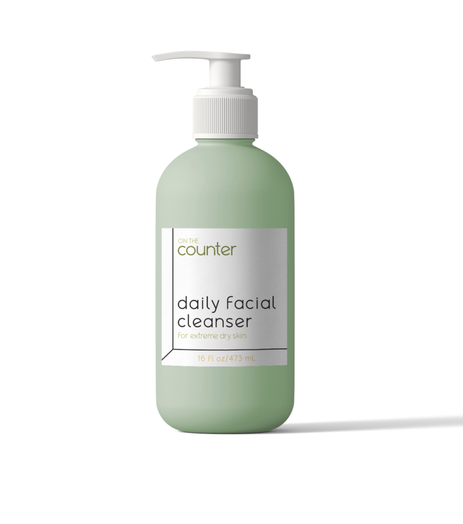
There is a complete facial line where each piece can work individually or collectively. This allows for an expanded consumer base from those with a limited budget to those where budget is not a consideration. Some people include many steps, while others just simply want to wash their face. On The Counter is for anyone chosing to implement some self-care into their day.
Shipping Packaging
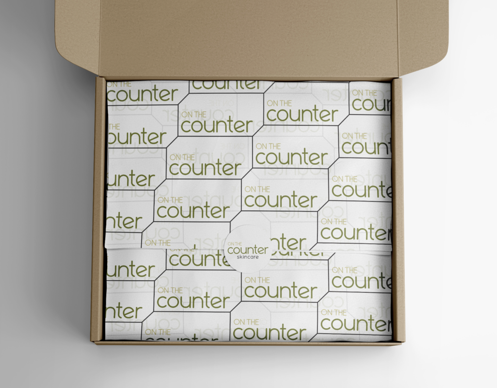
This pattern used for packaging is the logo arranged in a honeycomb fashion. It’s a grid that feels like a beehive; natural, healthy, and organic, but also clean and sleek like subway tile. The crisp black and white lines create order and structure similar to the full skincare line.
Promotional Images