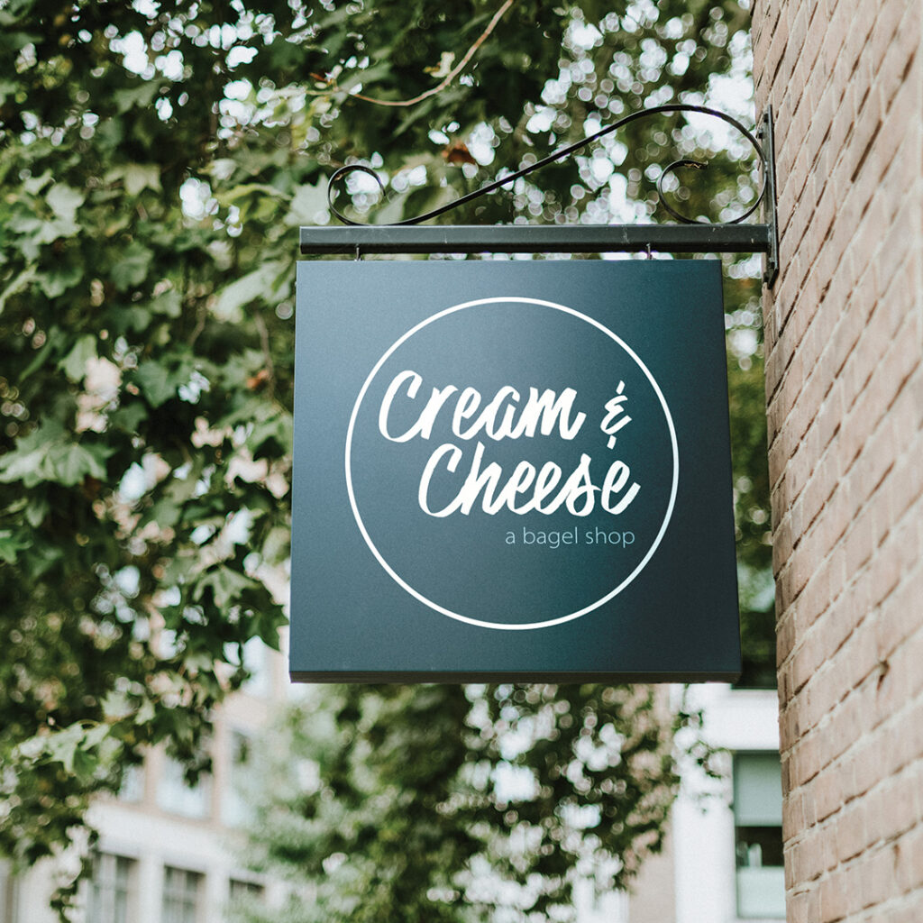
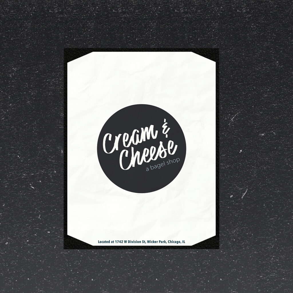
Cream & Cheese Bagel Shop
Cream & Cheese Bagel Co is a specialty bakery concentrating on all things bagels. Blending the laid-back and inviting atmosphere of a local coffee shop with the ready-to-go, fast-moving, high energy of a New York City bagel shop. Cream & Cheese invites people to use them as an out-of-home office, with the ever-present option to run in, grab a bite, and go.
Mood board
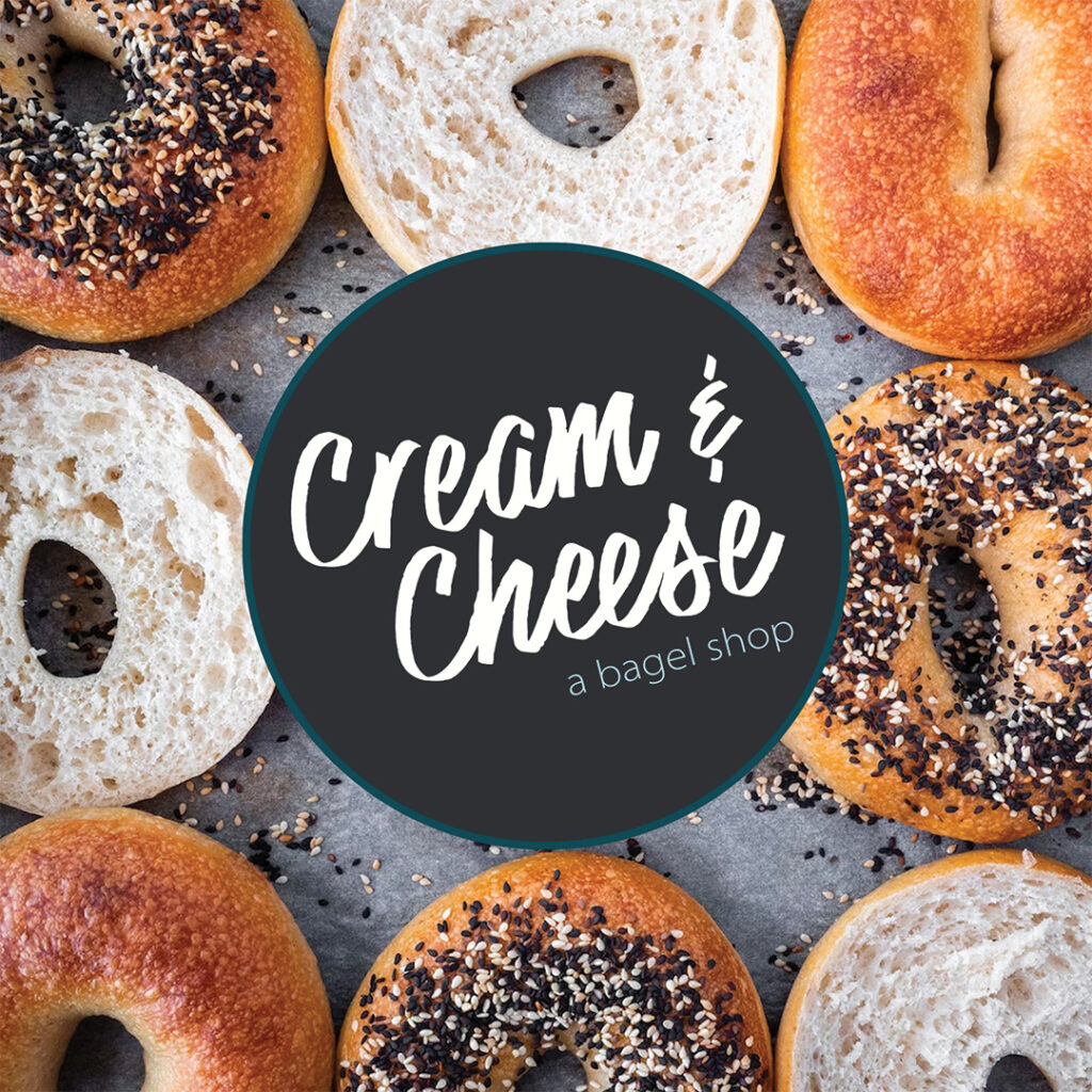
The spirit of Cream & Cheese is relaxing yet results-driven. The charcoal gray, matched with a dark turquoise and cream color is easy on the eyes and invokes a feeling of contentment. The font acts like handwriting. This shop is very hands-on, and down to the core it is about people. The people running it and the people passing through make it a deliberate destination. To encourage friendly person-to-person contact, a script, handwritten font conveys that mood.
Fonts & Colors


To-Go Bagel Box
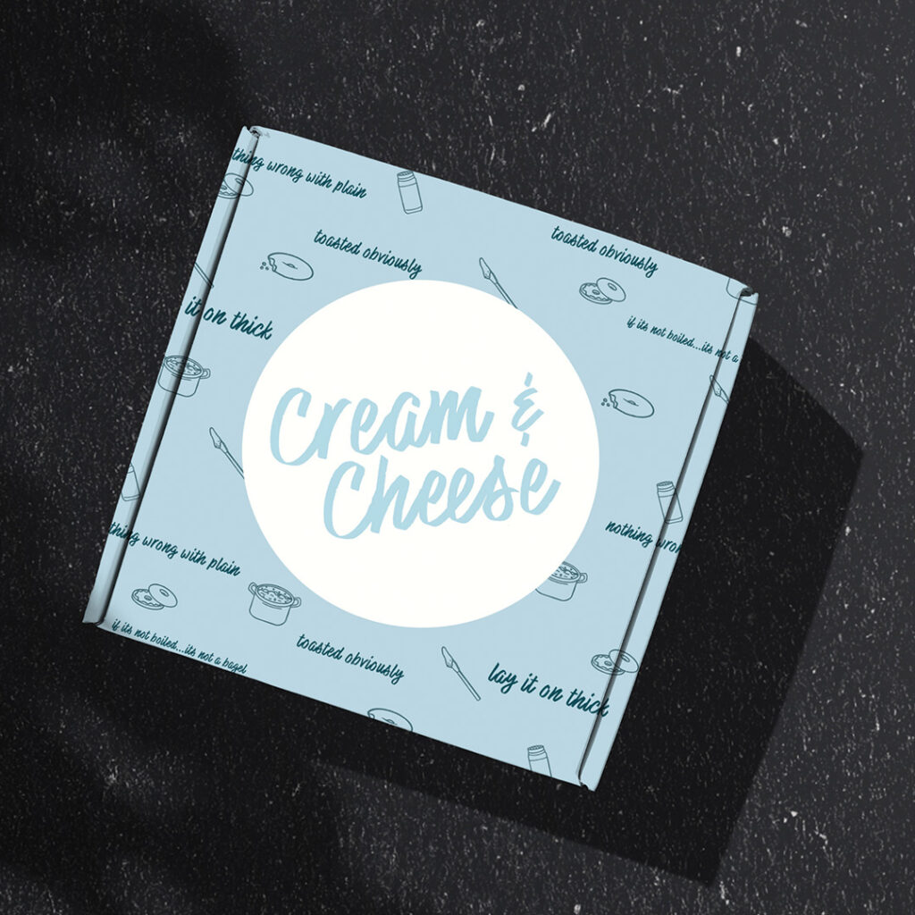
The carryout boxes for multiple bagels are an opportunity to have fun and play with variations and imagery. While curating the tiny images to scatter around the box, I thought of how bagels are made and enjoyed, from blending, boiling, and baking, to finally enjoying. The pot of water and a knife with a smear of cream cheese are all identifiable moments that coordinate with the process of the bagel. The little doodles help bring together the handwritten font, and the chill environment that Cream & Cheese is.
Menu
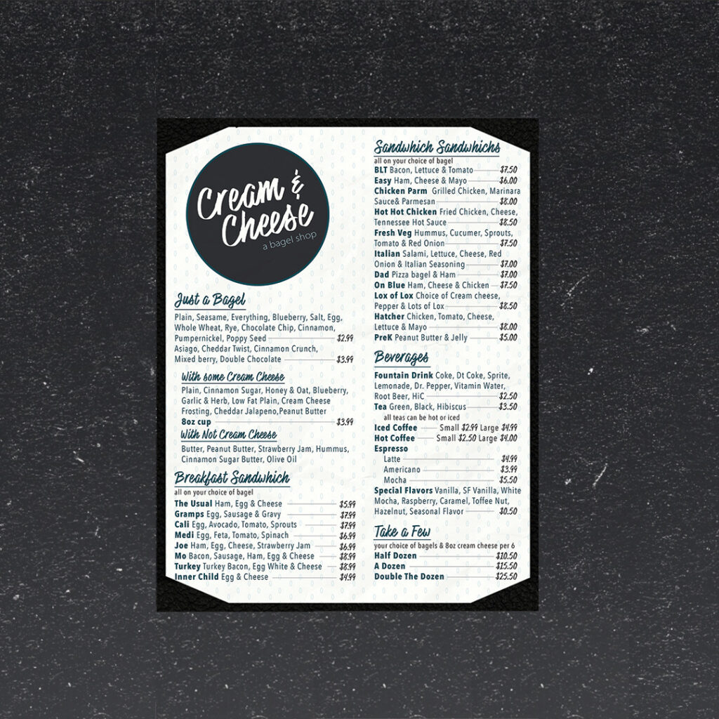
The menu is slightly more elevated than your typical bagel menu. The names are meant to illustrate the ingredients, and be straightforward, yet still have fun. I challenged myself to utilize a lot of text without sacrificing clarity and legibility. By creating a two-column layout this presented an organized array of items to choose from. The result is fun, informative and slightly whimsical with the subtle sesame seed background.
“Uniforms”
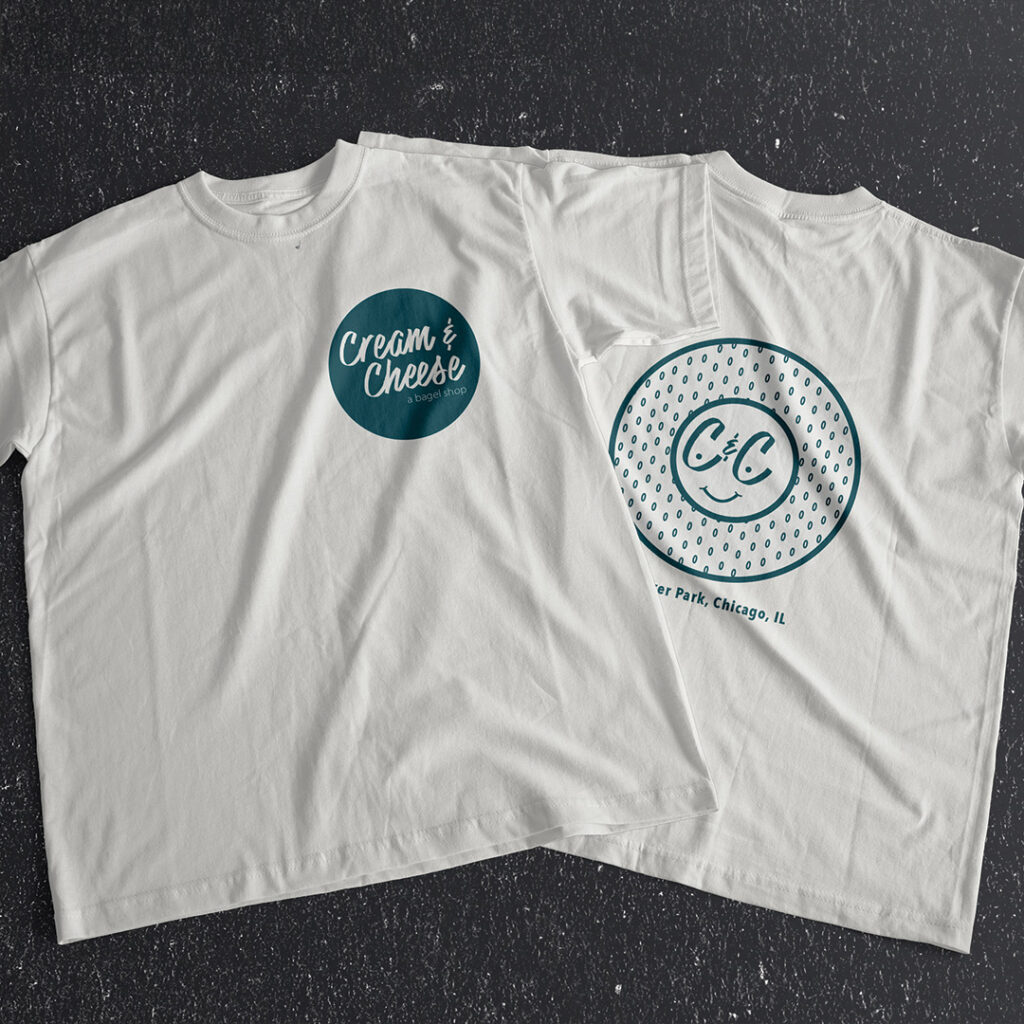
The team t-shirt looks like an everyday graphic tee. Nobody wants to wear a shirt that screams uniform. I played around with logo variations to make a tee shirt that plays off of the branding yet is still something I would genuinely reach for. Something that is simple, cute, and identifiable, yet still professional seemed to be the key to tie the people to the place.
To-Go Packaging
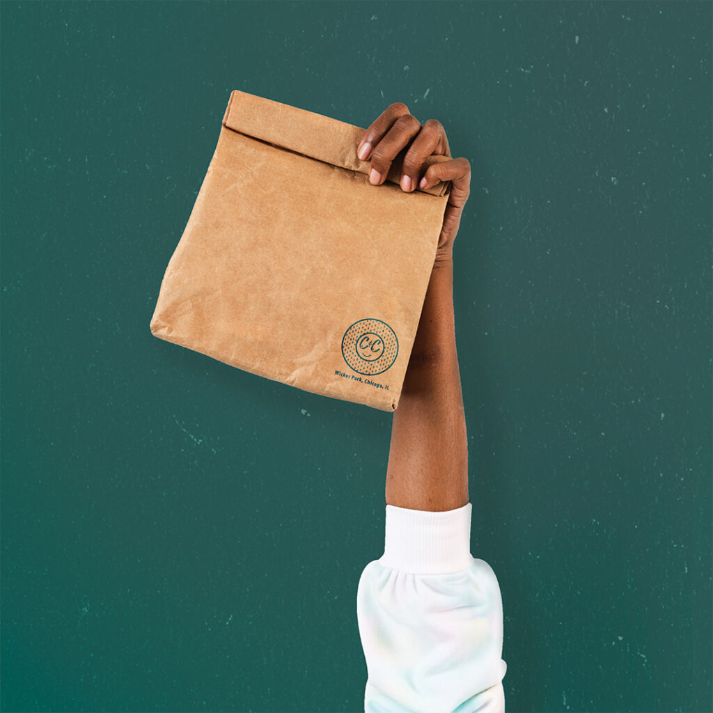
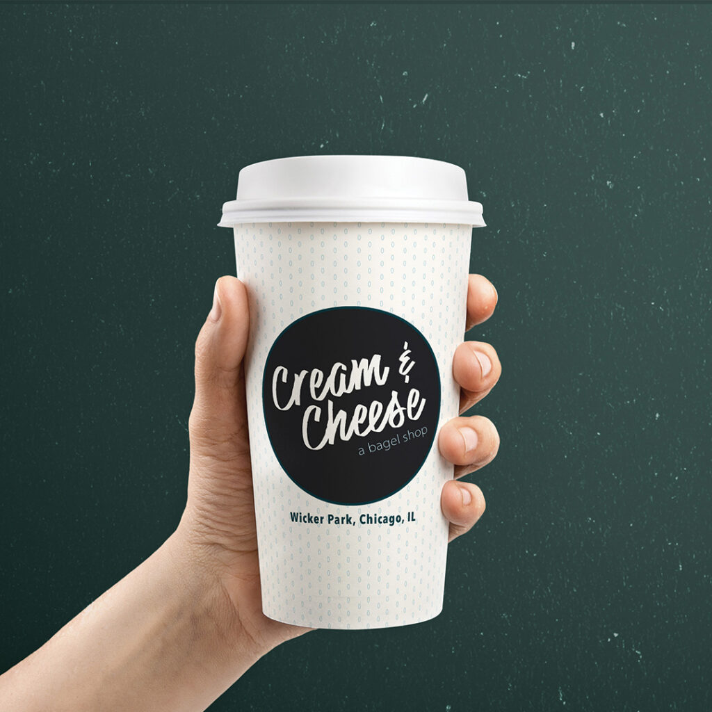
The packaging is simple and to the point. Bagels typically are classic items, with either cream cheese or breakfast ingredients. To keep the energy alive, the little brown paper bag & classic paper cup were key to the brand’s simplicity and fun.
Freebee Stickers
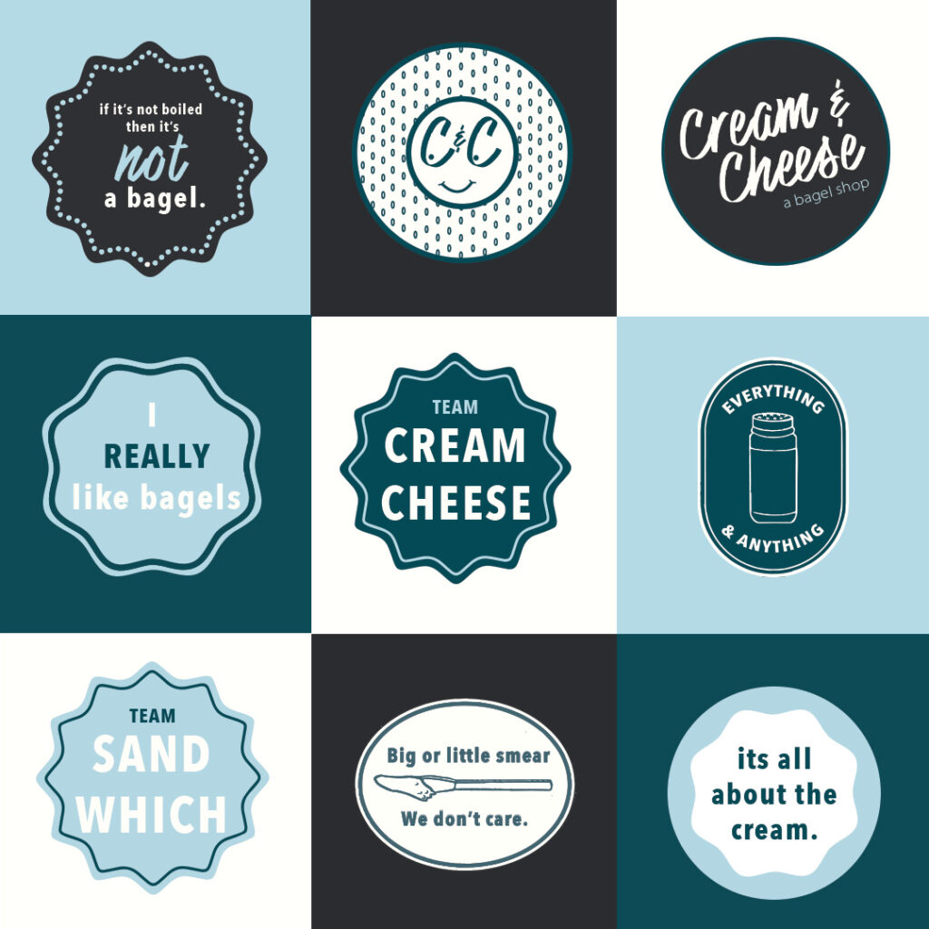
People love freebies and take-home items, so making something as simple as stickers with funny, catchy phrases is something tangible that customers can put on water bottles, computers, etc. It’s a great way of extending the brand out into the community but also letting customers become more connected to the company as a whole.